Opening Sequence
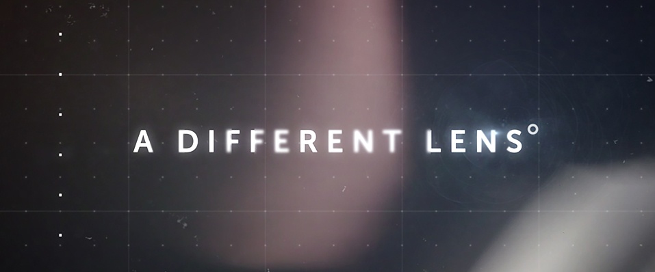
Monash University - A Different Lens
Client: Monash University
Agency: Y&RANZ
Animation Type: 2D, Motion Graphics
When marketing and communications company Y&R said "treat this opening sequence as if it was brought to you by Netflix or HBO”, our creative team couldn't believe their luck.
‘A Different Lens’ is a 5-part mini documentary series from Monash University, which features academics and industry leaders talking about current world issues.
It needed to go further than most opening sequences in order echo the complex nature of topics such as populism, globalisation, and extremism.
A clear-cut brief for complicated issues
The agency's brief was clear – create an opening sequence that was enjoyable to watch and felt on-trend, but also dynamic in its execution. One show in particular immediately sprung to mind…
“During our concept discussions, we raised the title sequence for Narcos,” Jumbla Creative Director Oz Smith said. “It features a mix of stock footage, VFX, and motion graphics in a strong, distinctive style.
“It made for a good starting point, but we wanted to create something a bit different and run with its main themes for even more appeal.
“Due to the documentary’s title, we knew it had to have an optical feel as well, with light effects and out-of-focus elements.”
Multiple techniques to create multiple layers
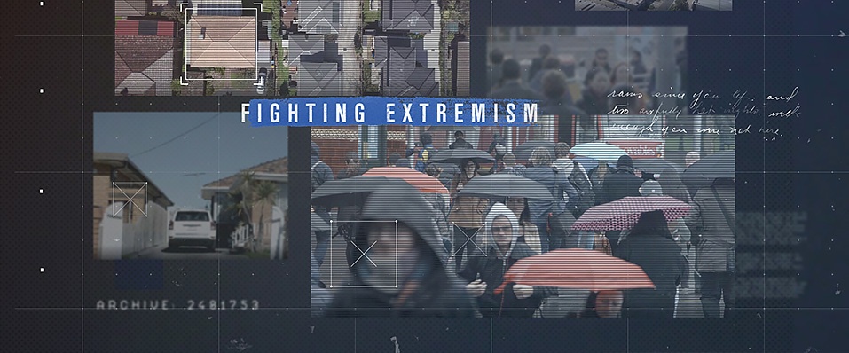
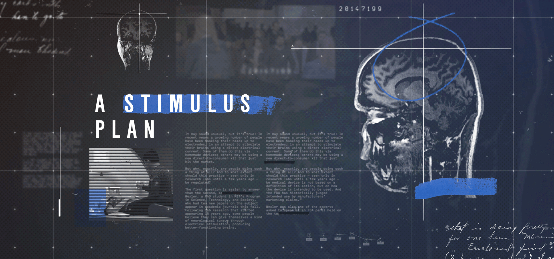
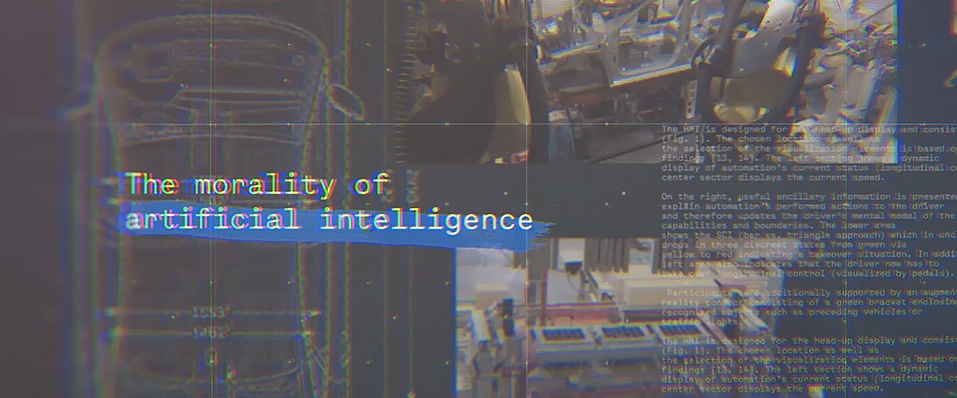
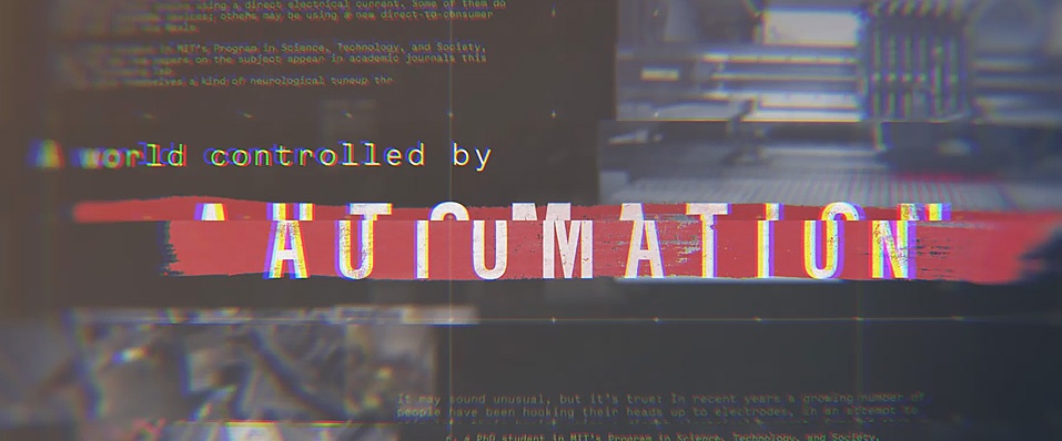
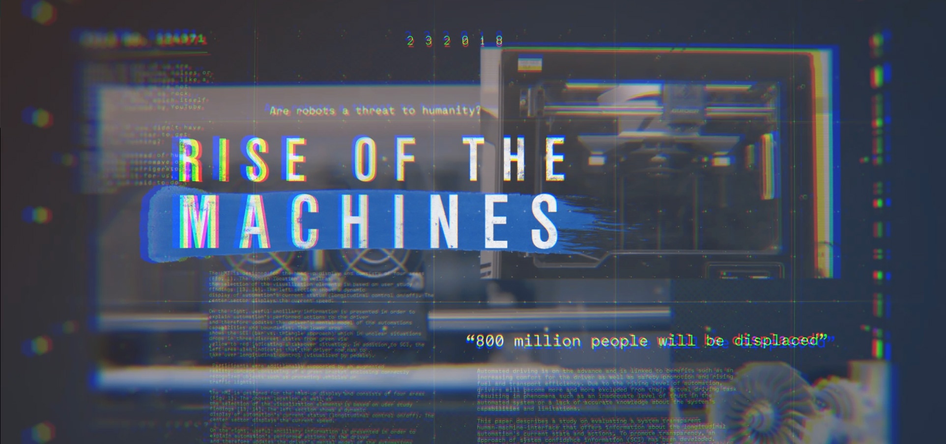
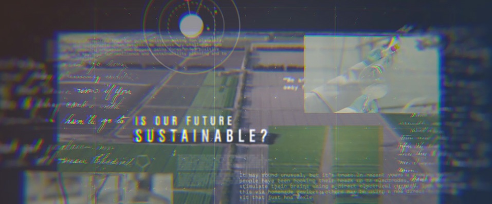
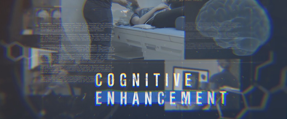
Words such as ‘layered’, ‘technical’, and ‘dark’ were key throughout. Various pieces of footage were complemented by thought-provoking phrases, provocative images, and detailed diagrams to create a link between the show’s premise and its title.
"We wanted to tie disparate pieces of footage together in a uniform style," Oz said. “We gave the titles movement and depth by breaking up the images into individual layers.”
This delivered a sense of parallax, which, when combined with camera movements, reinforced the often unnerving nature of news and current affairs.
Energetic, upbeat, yet slightly chaotic music matches the wealth of on-screen information and the speed at which it appears.
Last but not least, the final logo animation is in keeping with the ‘lens’ effect, which moves in and out of focus. This helps convey the idea that the news isn’t always what it seems.
Meeting a tight timeline with planning and preparation
“We had a short turnaround time with this one, so we got to work creating a style and building a framework until we received the actual footage, which we could just drop in,” Oz said.
“Working on the graphics before anything else really helped us get a sense of timing too.”
Like a lot of other projects, Oz cast his watchful eye over the creative process. But he was also quick to give credit to another member of the team.
“This one was Jeric’s baby,” he said. “He's a great all-rounder but we wanted to develop his skill set further, so we gave him an opportunity with art directing his own sequence.
“It went really smoothly and the client was super happy.”
