Explainer Video
DST Systems - Bluedoor
Client: DST Systems
Agency:
Animation Type: 2D, Motion Graphics
Our explainer video for DST Systems
We love a challenge of making the technical seem simple.
This piece promotes a financial platform that was created by DST. We’re proud of the fact that it’s able to convey the breadth and depth of the system, without getting bogged down in any of the technical jargon.
The video speaks to the everyday person, in everyday language – without skimping on key details.
Working hard behind the scenes
Through its innovative and practical designs, DST Systems makes a huge difference to online banking customers. Most of us, however, won’t even know they exist. That’s kind of the point!
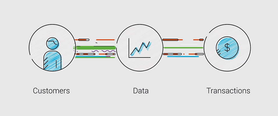
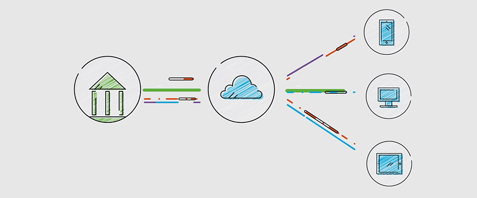
Most of us will only ever come face-to-face with our banks’ web portals (the 'front page'). But, there’s a whole engine of systems working in the background: a large number of cogs working to spin an intricate wheel that drives the banking transactions people and businesses do.
With the DST system, there is no separated 'front end' and 'back end'. Rather, everything is integrated.
That means when a transaction takes place, it doesn’t have to go through all these separated systems that all speak different languages.
Less is more
With the DST platform, transactions are quicker, the user experience is more convenient, data is more secure and companies get a clearer picture of their customers.
Using minimalist 2D icons – fused by chic transitions – Jumbla was able to convey a very strong argument in favour of DST. It’s an argument that’s grounded in simple, logical concepts that can appeal to anyone.


