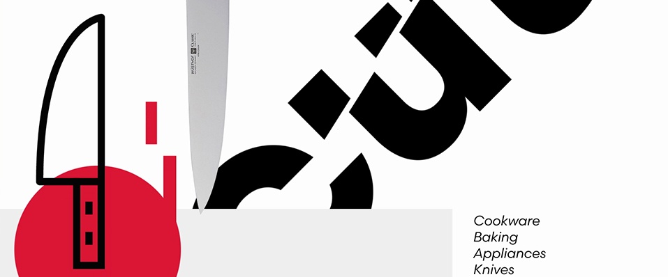
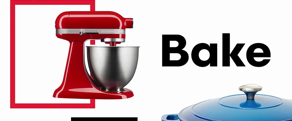
Our television commercial (TVC) for Kitchen Warehouse
15 seconds may not be volumes of time, but it can work wonders in conveying volumes of impact. This brand animation for Kitchen Warehouse is a prime example, combining motion graphics and photomontage to deliver a major punch in a modest timeframe.
The video is sharp, snappy and stylish. Most cuts are less than half a second, the colours are minimal and on brand (think newspapers: black, white and 'red' all over) and the transitions are everything.
It presents the viewer with a key argument: that the kitchen is the heart of the home, and that cooking, dining and entertaining is fundamentally practical, enjoyable and often social. Naturally, making the most of out this requires the right tools – and Kitchen Warehouse is there to supply it!
As the leading kitchenware experts in Australia (with the largest stores) it’s the go-to place for anything needed in the 'heart of the home'.
Kitchen Warehouse’s core philosophy is that cooking is about so much more than just preparing food. No matter how simple or fancy a meal may be, it’s a celebration of life and a timeless tradition.
“We wanted to bring life to this ritual and celebration. The transitions were our way of adding zest to these activities," said Jumbla Creative Director Oz Smith.
"For example, using a slice transition for the word ‘cut’, or using bubbles on the word ‘drink’. The percussive music really helped us convey that sense of vivacious fun in the kitchen!”
