Originally developed as an entertainment alternative, gaming is now a legitimate source of income for some players, thanks largely to the rise of Twitch.tv, YouTube, and eSports. But how can committed gamers sustain themselves when there’s no time to look away from the screen?
1337 Energy offers healthy and effective supplements for gamers, promising no crash or nasty side effects. Our challenge was to showcase this concept in a style that would echo the kind of graphical wonder 1337 Energy's audience is used to.
More than the client bargained for
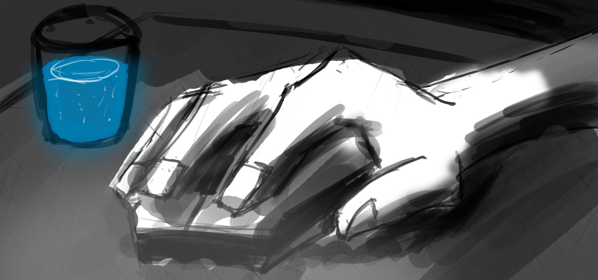
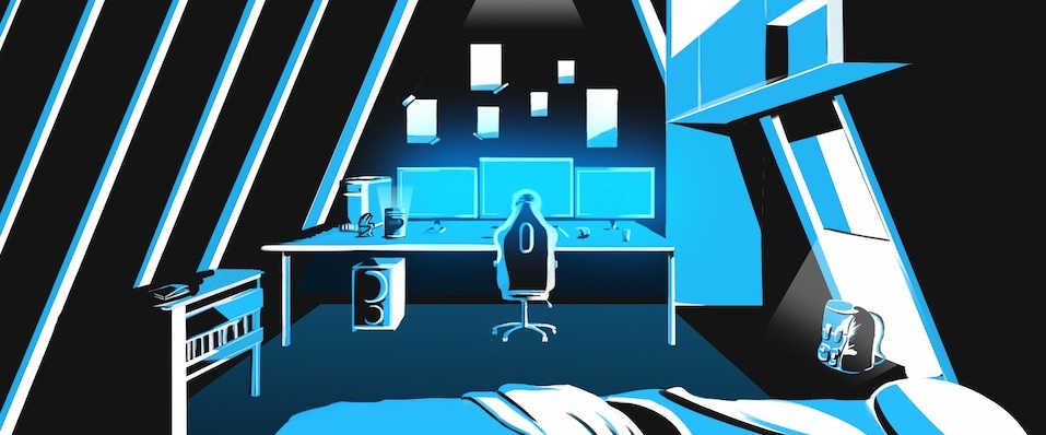
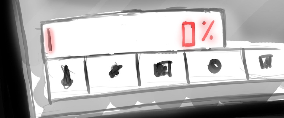
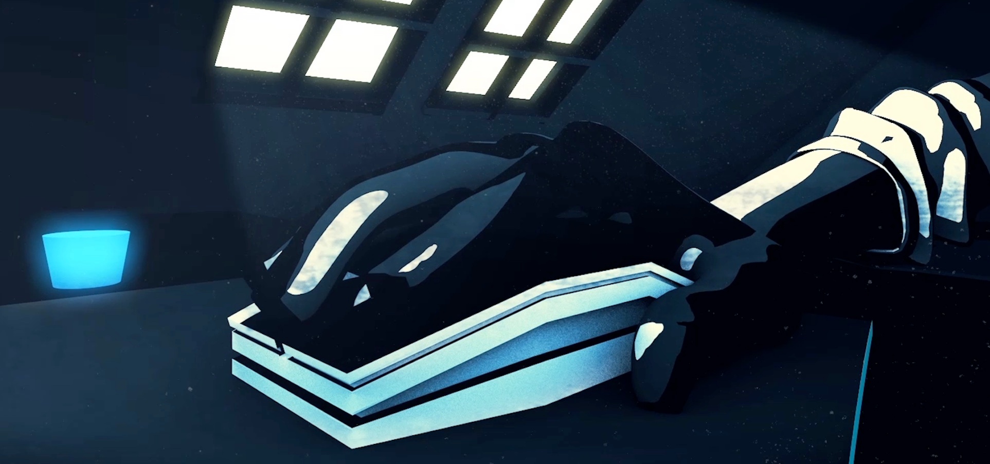
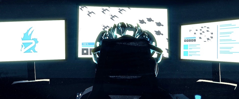
The client's brief was relatively simple - show a situational scene where the gamer plays, fails, drinks a cup of 1337 Energy, powers up, and wins. However, as Jumbla Creative Director Callan Woolcock explains, even small ideas and budgets can be ‘levelled-up’ ...
"Originally their budget allowed for a 2D-style animation, but their references and target market was more 3D inclined,” he said.
“We thought it would be a good opportunity to try some basic character animation in 3D using simple rigs that were easy to create with lower rendering times. The style was also more forgiving than a fully polished 3D masterpiece.”
Still, it’s easy for lower-end 3D animation to look unoriginal and tacky, something which Cal was careful to avoid.
“We needed it to look unique, stylised and interesting. Ultimately, the magic happened in the compositing stage,” he said.
“This is where we applied all kinds of textures and effects, giving it a real gritty, grungy, and edgy look. This would subsequently hide any imperfections from the 3D renders while giving it the stylised look we were aiming for.”
Pursuing individual passions for big picture gains
Any video game-related project that comes through our studio gets a great deal of attention. For Cal, it was an opportunity to experiment...
“Mixing animation styles is something I find interesting, and this piece allowed me to play around with that notion,” he said.
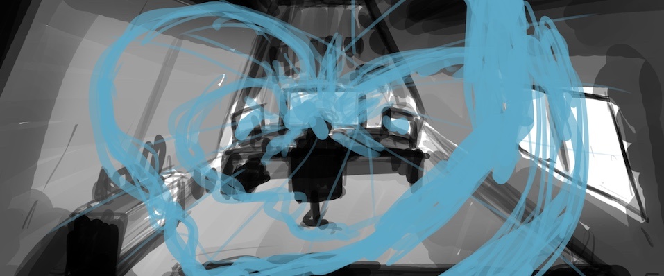
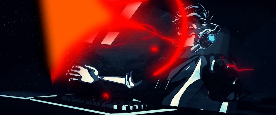
“We have 3D renders with 2D looping textures at different frame rates, matted into the various shades and tones, with frame-by-frame manga-style 2D visual effects created and composited into scenes.
“We also felt that with the target market in mind, the rawness of the techniques, the narrative’s emotive nature, and the overall pacing worked really well.”
Techniques utilised during previous projects, such as the frame-by-frame animation featured in our motion response piece for Pause Fest, helped streamline the creative process too.
Iconic inspiration
Cal returned to his childhood for certain aspects of the animation.
“The 2D effects inspiration was drawn from the 80s cartoon Thundercats. The opening sequence was animated by Tsuguyuki Kubo and has energy-like effects blasting around the screen,” Cal said.
“If you take a look at some of the still frames from these sequences, you can really see how well thought-out they are, and how they work together to create the illusion of movement and impact.
“We used similar-looking shapes for the Griffin at the end of our animation when it flies towards the camera and forms the logo. There’s something really striking about the shapes used.”
