Online Commercial
KFC Youth Foundation
Client: Edelman
Agency:
Animation Type: 2D, 3D, Animation, Motion Graphics
Due to a strong belief in empowering its young workforce, the KFC Youth Foundation is partnering with Australian charities to help young people establish their careers.
Working alongside PR firm Edelman, KFC asked us to come up with a video solution that would engage a young audience and tell the foundation’s story through animation.
Speed without compromising quality
Being provided a storyboard and detailed explanation allowed us to hit the ground running, but a short deadline of just three weeks meant speed was equally important as quality - something KFC knows all about.
"The timeline presented a challenge that we all wanted to take on," Jumbla Executive Producer Charlotte Parsons said. "It was important that every step was a move forward."
Along with daily progress meetings, the team would also reconvene to ensure pivotal scenes received the time and attention they deserved.
"We had some guys illustrating everything, another few animating everything, some working on sequences alone, and some working together," Jumbla Executive Creative Director Callan Woolcock said.
"It was all about staying coordinated and across everything so we were always on the same page."
Utilising the right techniques
Even with a detailed client brief, our creative team injected their flair into the final product, giving it that Jumbla stamp.
"The 2D perspective of 3D objects is popping up more in motion graphics and something I really wanted to get across," Cal said.
"I didn't want it to feel like the 3D stood out though. It needed to feel integrated within the 2D illustrations."
To do this, the team created a camera in After Effects featuring a really long zoom lens. This eliminated perspective when rotating around 3D objects in the 2D space.
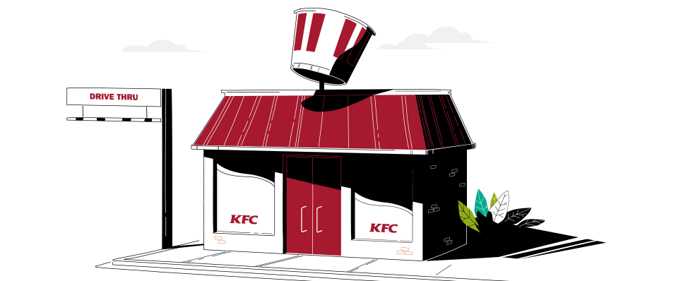
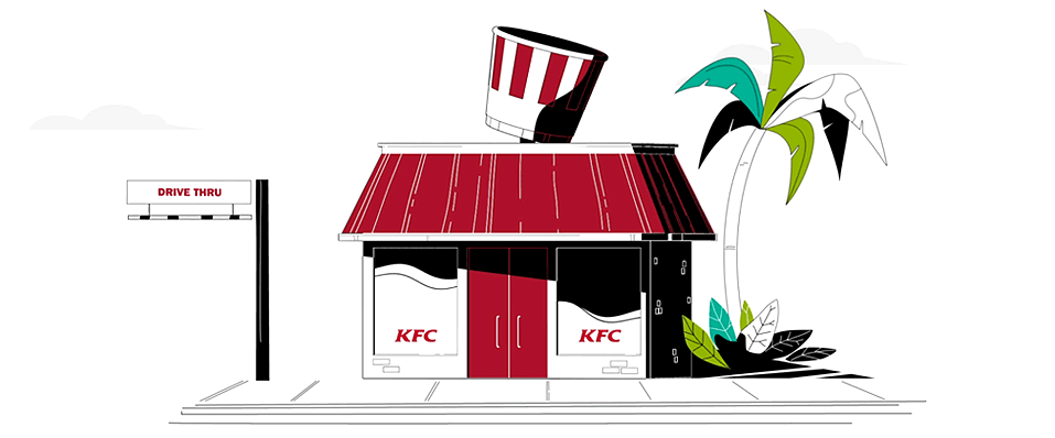
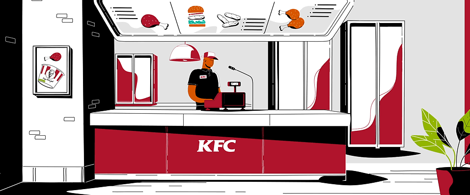
"For example, the KFC store at the start looks like a flat 2D image when you pause the frame, but in reality it's 3D," said Cal. "By pushing the creative further like this, we ended up with some really interesting and engaging sequences.
"As opposed to using shape layers and morphs in After Effects to eliminate perspective, the camera technique was a lot more friendly when it came to making edits and changes too."
Recognition, consistency, and intrigue
One of the project's biggest challenges was striking a balance between brand recognition, visual consistency, and rousing intrigue among young audiences.
"We were given enough creative license and trust from the client to take the animation in a really fun direction," Charlotte said. "The team stuck with the brief's brand guidelines for the colour palette but adopted some interesting techniques along the way to take it to the next level.”
While certain scenes have an air of familiarity, the non-stop nature of the on-screen action means the viewer is engaged to the very end.
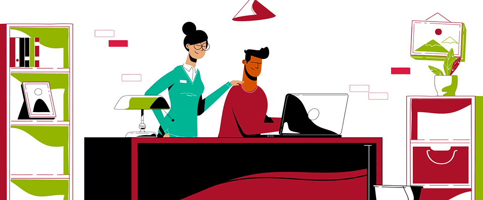
"Between 0:41 - 0:49, the desk always remains but the plants turn into bins and the cabinets morph into shelves," Cal said. "We needed to have designs featuring elements or objects that transitioned into the next frame.
"The other thing was to have movement all the time - not just the cameras but also keeping sequences connected, keeping animations progressing. If you look at the shadows in each scene, at the very least they're always waving."


Start an Animation Project
Click below to submit your project details and a senior producer will get back to you within one business day.